The Mastodon dashboards I’ve been developing and describing in this series are backed by a Steampipe plugin that translates SQL queries to Mastodon API calls. Like all Steampipe plugins you can use this one to run those queries in all sorts of ways: from psql or another Postgres CLI (perhaps via cron, perhaps in a CI/CD pipeline); from Metabase or Grafana or any Postgres-compatible BI tool; from Python or JavaScript or any programming language. The Steampipe core is a versatile software component that you can plug into just about any environment.
There’s also, of course, Steampipe’s dashboards as code approach which powers the alternate Mastodon UX that I’ve been exploring in this series. You can think of this dashboarding tool as a primitive web browser with a freakish talent for querying Postgres and weaving SQL results into widgets such as infocards, input controls, charts, tables, and relationship graphs. You compose widgets using HCL (Hashicorp Configuration Language) instead of HTML, arrange them using basic layout syntax, and view them by connecting your browser to the local Steampipe dashboard server or to cloud.steampipe.io.
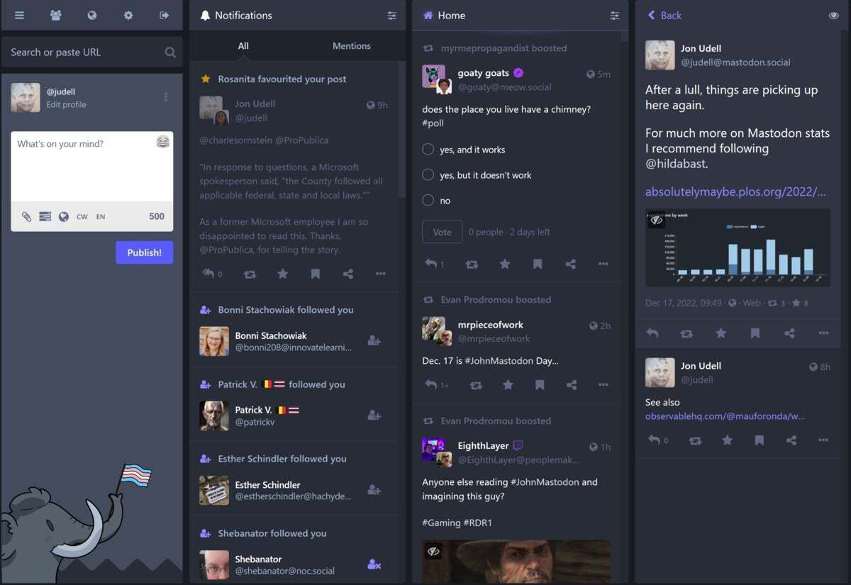
The alternate Mastodon UX built this way was aptly described (thanks again Greg Wilson!) as A Bloomberg terminal for Mastodon. As a reminder, the stock Mastodon web client looks like this.
 IDG
IDG
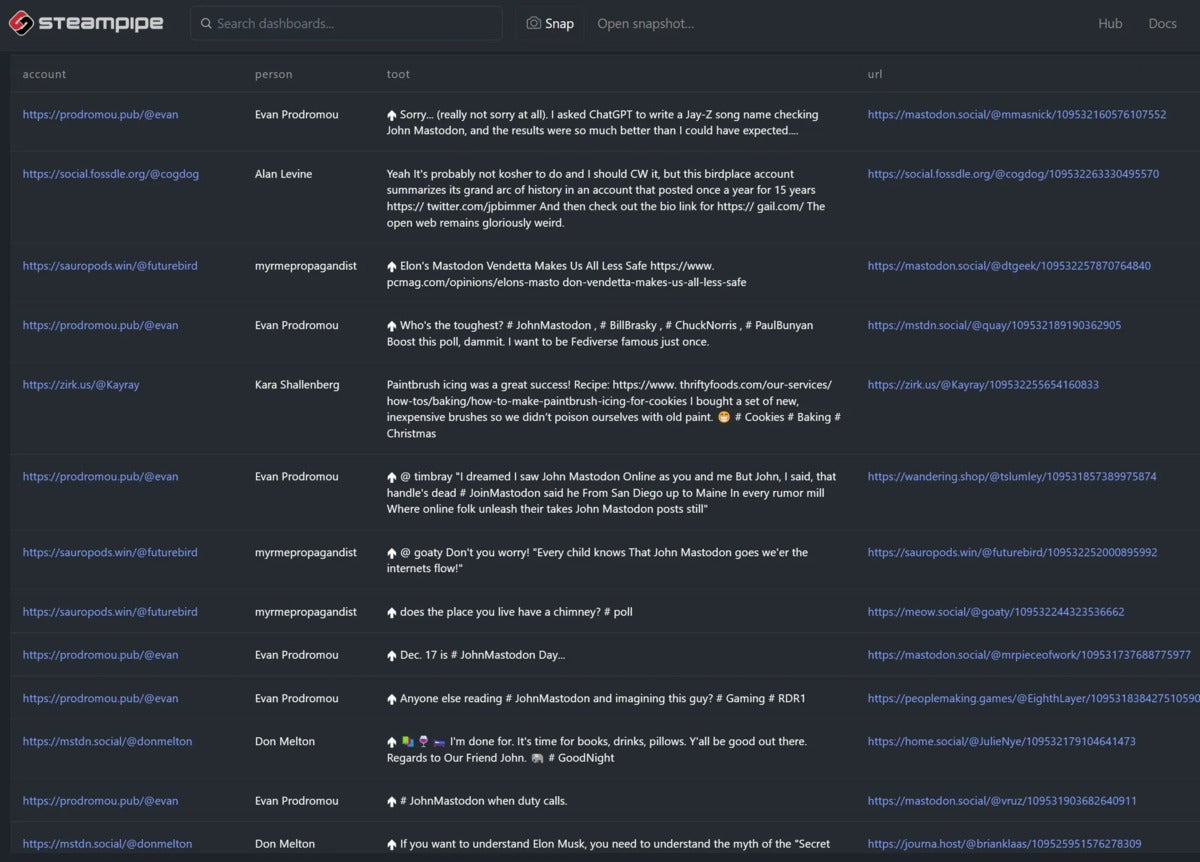
And the pages served by the Mastodon dashboards look like this.
 IDG
IDG
I can scan the latter view far more effectively.
Now, I’ve been trying out a bunch of alternate Mastodon clients lately. I love Ivory on my phone, and Elk in the browser, and I use them when I want an experience that feels social-media-ish. But I don’t use Ivory or Elk or Toot! or the stock Mastodon web clients (browser, phone) when I want an experience that feels RSS-reader-ish.
For some information landscapes I want to unfold a big map, spread it out, and scan for points of interest. Social media is that kind of landscape, RSS readers were the first way I surveyed it effectively, and these Mastodon dashboards are becoming my new way.
When I compare those two screenshots though, it’s not just the density of the latter that I notice, but also the absence of pictures. At first I fretted about that. Could the dashboard pages render full-strength HTML? Perhaps they will, and there are a few different ways that could happen, but meanwhile I’ve come to embrace the text-only constraint. When I’ve got my map unfolded, and I’m scanning my home timeline or my lists for things to click into, images can be a distraction. I wouldn’t have chosen to omit them, but I find that their absence enables me to focus very effectively on who is speaking, and what they are saying or boosting.
There is also, of course, the graphical view afforded by relationship graphs. These feel very map-like in the way they reveal clusters of people interacting with one another. I’m finding them more useful than anticipated.
But the text that I read in these dashboards is image-free for now. And I think it’s having a calming effect. There are plenty of times when I want images, don’t get me wrong, and that’s partly why I use a mix of conventional Mastodon clients. But there are times when I want to dial down the clutter, just like there are times when I switch my phone to monochrome.
Two things can be true: The pictures we share with one another are a source of joy, and they are sensory overload. I’ll make them optional here when I can, and I would like to have the option to use all social media interfaces in text mode.
This series:
- Hope for the fediverse
- Build a Mastodon dashboard with Steampipe
- Browsing the fediverse
- A Bloomberg terminal for Mastodon
- Create your own Mastodon UX
- Lists and people on Mastodon
- Mastodon tooters also tweet
- Instance-qualified Mastodon URLs
- Mastodon relationship graphs
- Working with Mastodon lists
- Images considered harmful (sometimes)
Copyright © 2023 IDG Communications, Inc.
Originally posted on February 3, 2023 @ 2:37 pm

![Read more about the article How To Get a South Africa IP Address 2022 [South African Content]](https://sonicsurfisp.com/wp-content/uploads/2022/11/how-to-get-a-south-africa-ip-address-2022-south-african-content-300x169.jpg)